MAEVE MAGAZINE
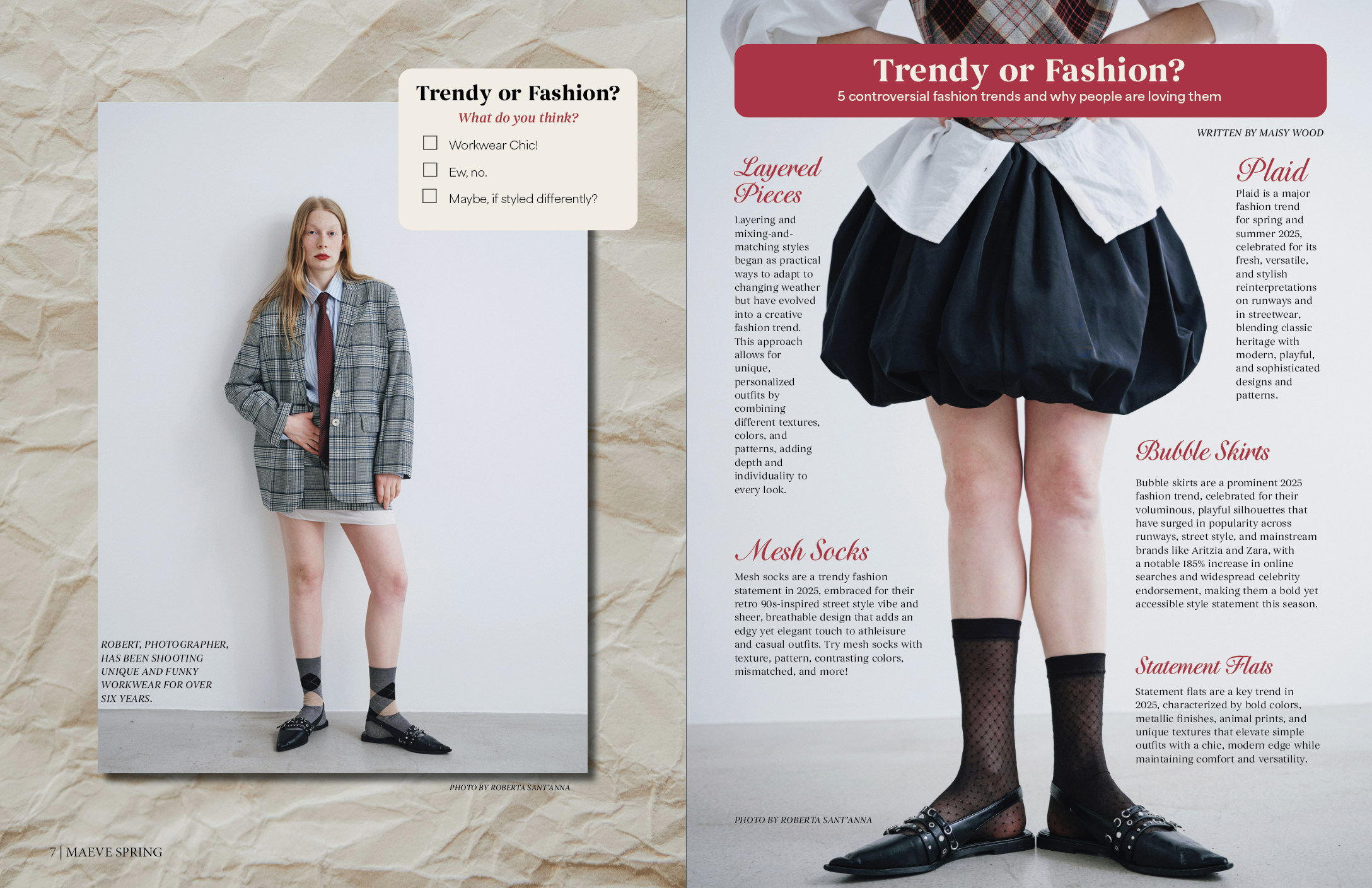
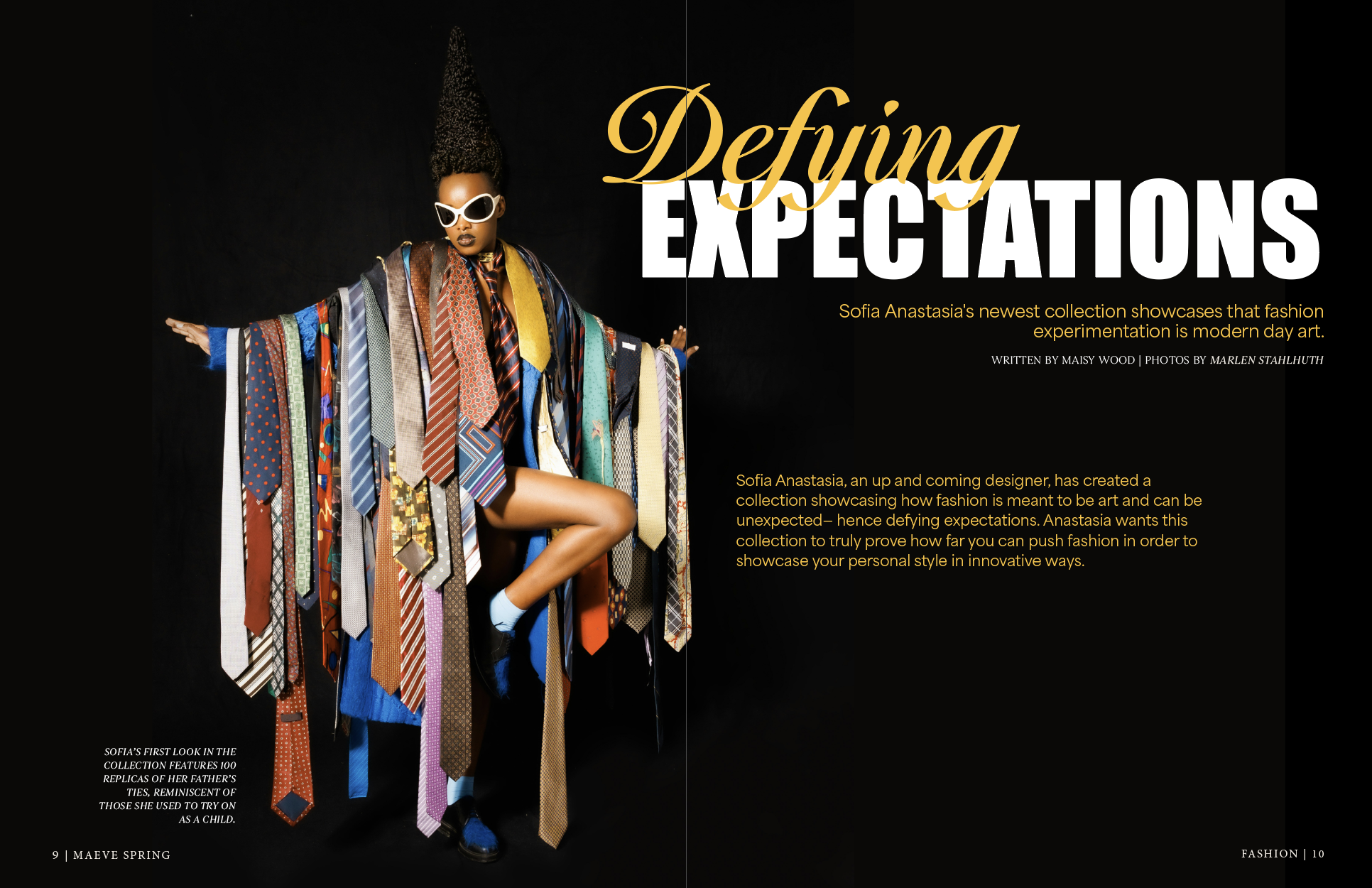
This magazine is a product of my Publication Design Course! During this course, I learned all about publication design terms, principles, parts of a magazine, how to make your magazine stand out, how to design for your target audience, and much more! I hope you enjoy looking through my magazine as much as I loved designing it!
Cover
Name: maeve magazine
Frequency: once a season (4 per year)
This edition: first edition, spring 2025
Format: 8.5 x 11 glossy color magazine
Audience and Concept: My target audience is college-aged women, ages 17-26, although other demographics are always welcome if they are interested in the topics we talk about here! The readers of Maeve magazine are bold, bubbly, trendy, authentic, and empathetic people who love a good lifestyle magazine that reflects their interests, give them advice for things happening in their lives, and they enjoy bold images, colors, and typefaces that will keep them engaged and keep them coming back for every issue! Maeve is a fresh, modern, and interactive magazine for those who love topics such as fashion, food, college and career, wellness, crafts, and so much more! The feel of this magazine reflects our target audience being friendly, bright, bold, trendy, authentic, fun, engaging, and casual, while communicating to our readers that they can be powerful, strong, empowered, become the best version of themselves, juggle everything they dream of doing, and have fun!
P.S. All the stories included in my magazine were written by AI to be used as filler text. They are not my words. I did write all of my captions, bylines, blurbs, and pull quotes :) Enjoy!
Table of Contents
Social Page
Letter from the Editor
Section Front
Alternative Story Form + Interactive Element
Picture-Driven Story
Data-Driven Story
Cover Story
Round-Up
I am very proud of how this magazine turned out. I completely changed my magazine three times over before I was happy with it, and I am so glad that I put in those extra hours, because without it, I wouldn’t have grown as much as I did as a designer. In my previous editions, I was playing with different styles, different typefaces, and different colors, which didn’t make my magazine look cohesive at all. It looked like each page was from a different magazine. From there, I tried to refine my typefaces and colors into another version of the magazine, and finally, I landed on this magazine, which is refined down to 4 colors (3 main colors), and 4 typefaces. Again, I love how it turned out, and I am so glad that I refined my design so many times to get to where it is today!


